tracking mining with multispectral satellite imagery
This is a writeup of research into using satellite imagery to track mining operations, funded as part of Bellingcat’s 2024 Technical Writing Fellowship, and is a more in-depth version of a short guide published on their online platform. The accompanying Multispectral Satellite Imagery Explorer tool is available here. This guide is intended as an overview of my research, and a starting point for these techniques.
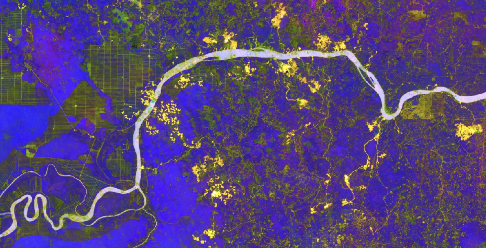 a false colour satellite image of bauxite mines (yellow, with white centres) and palm oil plantations (green-brown grids) near the Kapuas river, West Kalimantan (Google Earth Engine / Landsat 8)
Satellite images we encounter on platforms like Google Earth are typically rendered in ‘true colour’, which emulates how a scene might look when viewed with the naked eye. This rendering mode is natural, and is useful for producing images where the contents are easily recognisable.
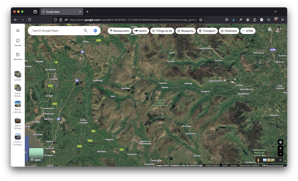 true-colour satellite image of the Yorkshire Dales, taken from Google Maps
However, satellite imaging sensors also typically capture infrared light, which is beyond what the human eye can normally perceive. This is known as ‘multispectral imaging’. This outside-of-visible-range information is particularly useful in understanding the environmental context of a scene, giving information about the geology, vegetation, the presence and quality of water, air quality, crop varieties and even building materials and techniques.
This is a guide to using multispectral satellite imaging to investigate mining operations, using contrasts between different parts of the light spectrum to highlight differences in mineral and chemical composition. While mining is chosen as the example, this kind of analysis can be used more broadly to understand geopolitical events through the lens of accelerating ecological change. For an example of how multispectral information can be used in this way, this 2021 investigation into the role of water stress into conflict on the Kyrgyzstan/Tajikistan border uses thermal, vegetation and moisture indices to contextualise the analysis of a nominally unrelated dispute about security cameras.
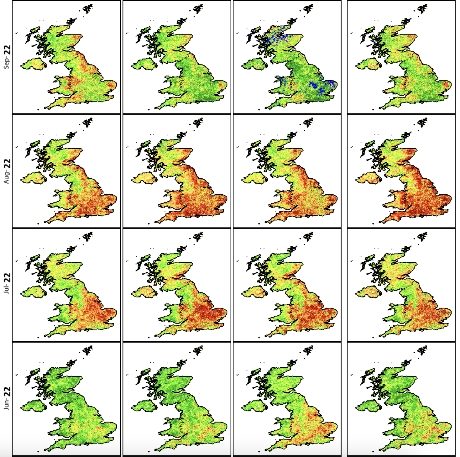 vegetation health during the Summer 2023 drought in the UK, taken from the FAO’s Earth Observation tool. The metrics used to create these images are calculated by combining visible and infrared light collected by the AVHRR sensor on board the Metop satellite.
To accompany this guide, I have developed a tool that gives a ‘tour’ of these different multispectral imaging techniques, linked to existing investigations into the mining industry. Both the tool, and the images used in this guide use imagery from the Landsat 8 Satellite imagery dataset, which contains data from 2013 to the present day. (there’s a couple of images from the recently-retired Landsat 7 satellite to show pre-2013 analysis, these will be indicated). This guide is intended as an overview of the use of multispectral imagery in OSINT, and not a detailed guide to writing code. For this, Ollie Ballinger’s Remote Sensing for OSINT guide is a fantastic resource, and covers many of the techniques used here, and is a good intro to writing a similar tool.
A note on language: the terms ‘satellite imaging’ and ‘remote sensing’ are often used interchangeably, the latter describing the broader collection of data from a distance, whether through satellites, aircraft or drones, while the former describes images taken using satellites specifically. For clarity, I will use the term ‘satellite imaging’ throughout this guide.
the electromagnetic spectrum

Before understanding how a satellite image is constructed, it’s worth looking at how we perceive light. All of the light that we see is part of a much larger range of radiation known as the ‘electromagnetic spectrum’. Electromagnetic radiation travels in waves, and includes forms of radiation like X-rays and infrared radiation, that humans cannot see but can be detected through other means. The electromagnetic spectrum is ordered by the ‘wavelength’ of the radiation, a property that changes the way that light interacts with different materials. ‘Visible light’ – e.g. light that can be seen with the human eye – ranges between the infrared light (which has a longer wavelength) and ultraviolet light (which has a shorter wavelength) on the electromagnetic spectrum.
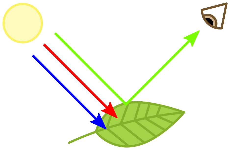 the chlorophyll in healthy plant leaves absorbs blue and red light – when this breaks down in the Autumn, leaves stop absorbing red light, causing green and red to be reflected and changing the leaves to orange. (Wikipedia)
All substances either reflect or absorb different wavelengths of electromagnetic radiation in some combination, and by examining how radiation interacts with a particular material, it’s possible to make some inferences about what that material is. Satellite imaging datasets will often describe what they measure as ‘surface reflectance’. This literally means, measuring the different wavelengths of light that are reflected, rather than absorbed, by whatever is on that part of the Earth’s surface.
Consider plants – when we see an area of deep green on a ‘true colour’ satellite image, we typically associate that with vegetation. This green colour is due to the presence of chlorophyll in plant leaves, which reflects green light waves.
Interestingly, there is a second kind of light that healthy plants reflect that isn’t visible to the human eye. This other wavelength falls in the shortwave infrared range, where the light waves are too long for the human eye to see, but can be picked up by some animals, and, crucially, by satellite imaging sensors. This extra information becomes important for differentiating between healthy and unhealthy vegetation, and making inferences about the type of crops in a region. Notably, it’s also invaluable for differentiating between astroturf and real grass…
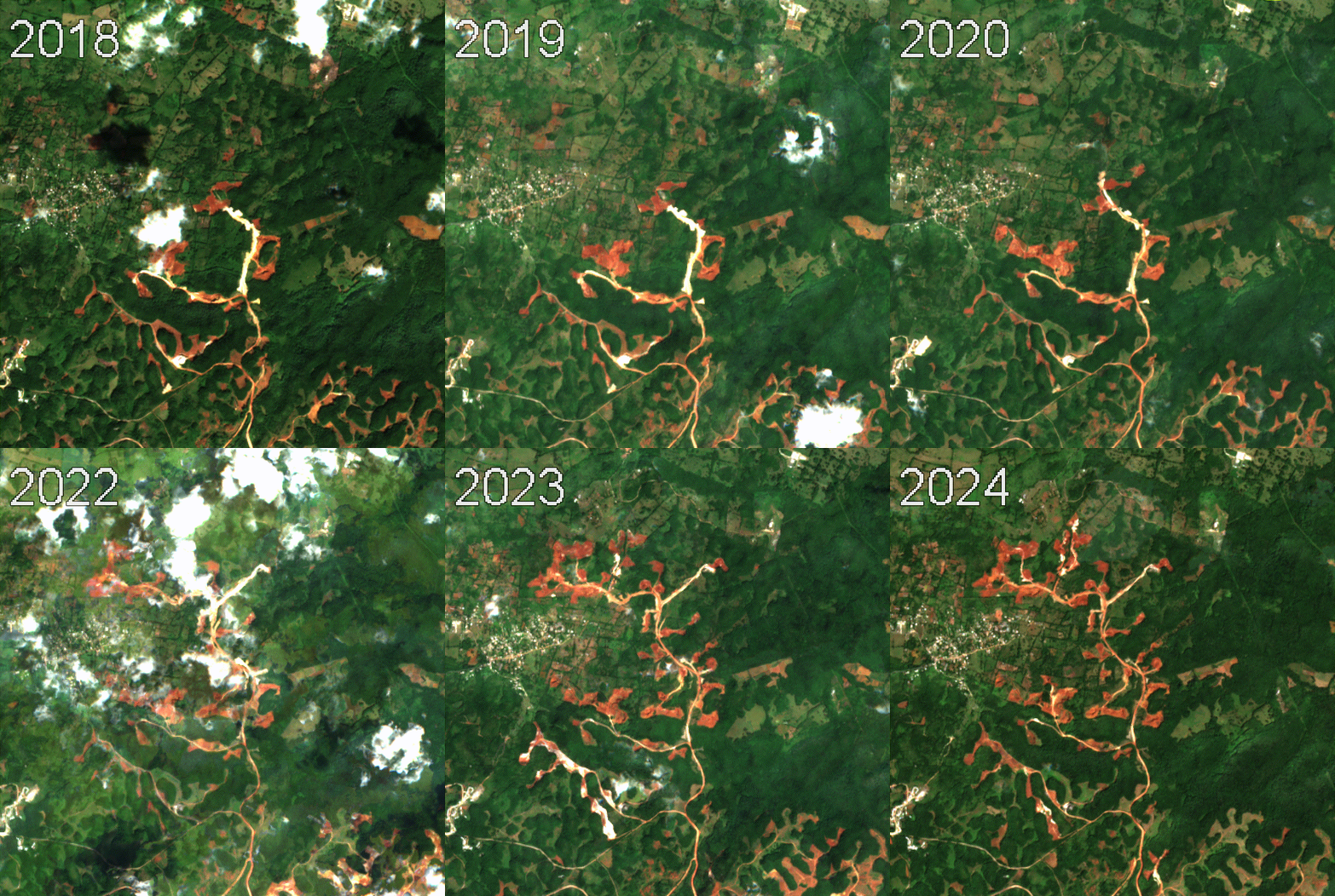 a true-colour timelapse of spreading Bauxite mines in St Ann Parish, Jamaica (Google Earth Engine/Landsat 7)
ways of seeing
There’s a nice line from the information theorist Gregory Bateson, which describes information as ‘the difference which makes a difference’ – in other words, much of our ability to sense and act in the world rests on noticing discontinuities – in time, form, colour, and through other sensory means. Often, visual forms of investigative work involve highlighting a difference so as to make it more visible – picture a ‘before and after’ image, or a clip that shows the shrinking of a lake or the expansion of a construction site – to draw inferences about higher-order events.
One key form of difference available to human perception is the ratio of the red (R), green (G) and blue (B) light in an image. Most peoples’ eyes distinguish between these colours very effectivelymany people suffer from colourblindness, which can make the differentiation between different parts of the light spectrum more difficult, and give us a form of vision that is distinct from other animals – a dog, for example, has only two different kinds of photoreceptors in its eyes, resulting in a form of vision that consists of yellows, blues and greys.
note: satellite imaging dataset structure
Just as a digital camera image captures red, green, and blue data in different layers, a satellite image contains layers called ‘bands’, each with information from a specific segment of the electromagnetic spectrum. Different satellite datasets will vary in the number, width (e.g. what range of wavelengths a band contains) and distribution of bands, with commonly-used datasets such as Landsat, Sentinel and MODIS having around 8-9.
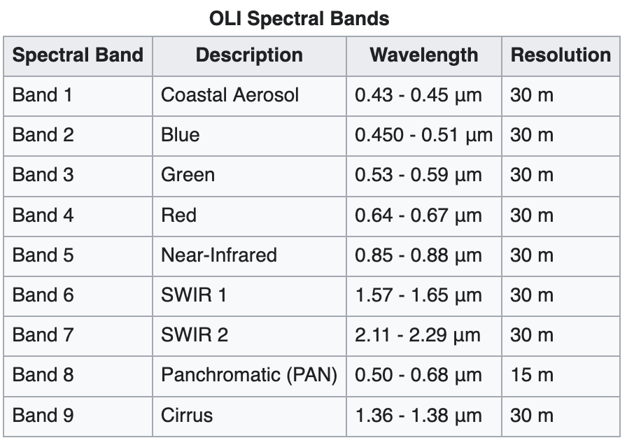
 table of bands captured by Landsat 8, by the OLI and TIRS sensors respectively (Wikipedia)
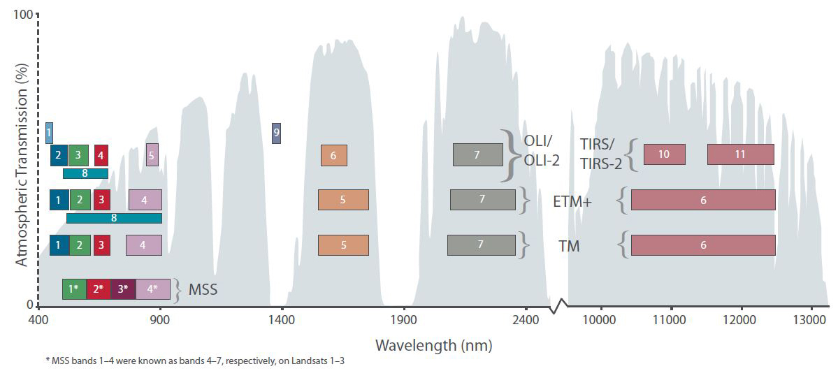 the spectral placement of different Landsat bands, mapped against the atmospheric absorption spectrum (image credit: Wikimedia)
For each image of the earth’s surface captured, each ‘band’ in the dataset will consist of a black-and-white image representing the intensity of surface reflectance in that band. The brighter the pixels, the more light is being reflected in that part of the spectrum. Combined together, these bands can be used to reconstruct colour images.
In different satellite image datasets, the numbering of the bands will correspond to different parts of the spectrum. In this guide we will use Landsat 8 band numbering, however
 diagram of the OLI sensor on board Landsat 8 (Wikipedia)
One important thing to note is that sensors (the things that actually capture the data) normally have different names to the satellites themselves, and one satellite may have many sensors on board. Thus, you might often see Landsat 7’s dataset referred to as ‘ETM+’ (Enhanced Thermal Mapping), or Landsat 8 (which contains two different sensors) as OLI (Optical Light Instrument) and TIRS (Thermal Infrared Sensor).
seeing more with band comparisons
Multispectral satellite imaging techniques use differences between light reflected in different bands to reveal information about a scene. Consider the following example, a satellite image of lakes around the American town of Sandersville, Georgia, surrounded by a series of white patches.
This first image is a typical ‘true colour’ satellite image, like you’d see on Google Earth. This image has been composed by taking the R, G and B bands separately, and displaying the R band with the red pixels of your computer screen, the G band with the green pixels, and the B band with the blue pixels.
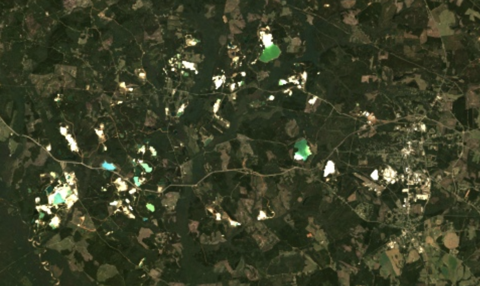 (Google Earth Engine/Landsat 8)
To get a different perspective on the scene, we can use a ‘band combination’ – a false colour image that makes use of out-of-visible range information to highlight different features of the scene.
Shown below is the classic ‘vegetation’ band combination, which uses the Near Infrared (NIR) 5 band in the ‘R’ slot, with ‘R’ information in the G slot and G in the B slot (Landsat 8 bands 5, 4 and 3 respectively)why this order? Within Earth Observation (EO) there are conventions as to what bands go into which ‘slot’ of the image, normally in descending order – though you would still be able to see differences by swapping them around.. In areas with large amounts of vegetation, this will produce a very bright red image. The darker red indicates areas where the vegetation is healthy – lighter red indicates sparser vegetation.
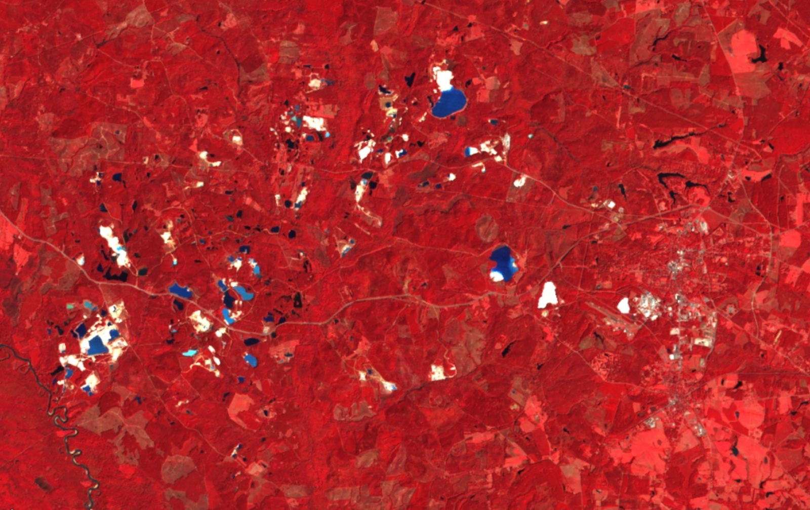
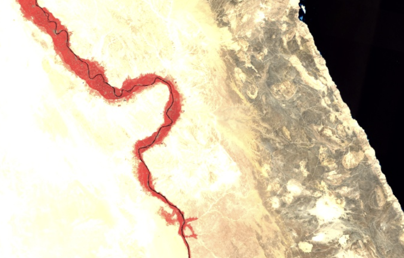 for comparison to the NIR image of Sandersville, shown here is the same band combination (5, 4, 3) applied to the Nile Valley in Egypt (Google Earth Engine/Landsat 8)
Note that the same chalky-white patches have appeared in all of the images so far, meaning that whatever substance is there is reflecting all incident radiation of the wavelengths we’ve been looking at, including this Near Infrared band.
However, in this next image, we can see that some of the patches are no longer white. This image was generated using the 7, 6, 4 band comparison, also sometimes called the Shortwave Infrared comparison, which is also used to monitor soil health. Now, around half of the white areas from the previous image are now cyan in colour, and there’s a much greater degree of contrast and variation in those areas.
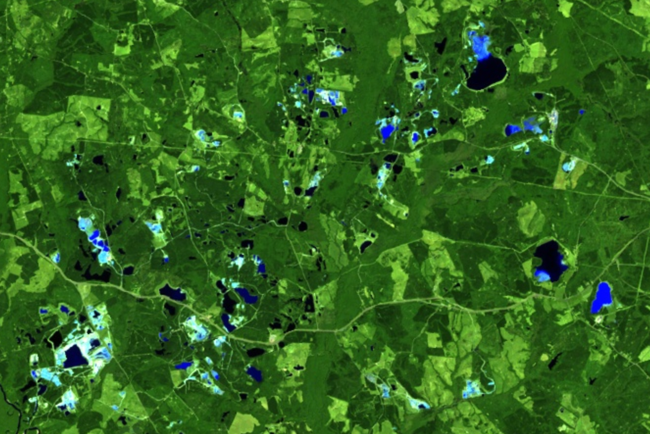 (Google Earth Engine/Landsat 8)
What we are looking at are lakes with high deposits of kaolinite – a clay mineral – in Sandersville, Georgia. Kaolin clay is mined in large open-cast mines for use in the paper, ceramics and coatings industry. It’s part of a geological feature that passes diagonally through Georgia, known as the ‘fall line’, that separates two tectonic plates. Hundreds of tons of kaolin clay are extracted each year from this area of Georgia, from large open pit mines.
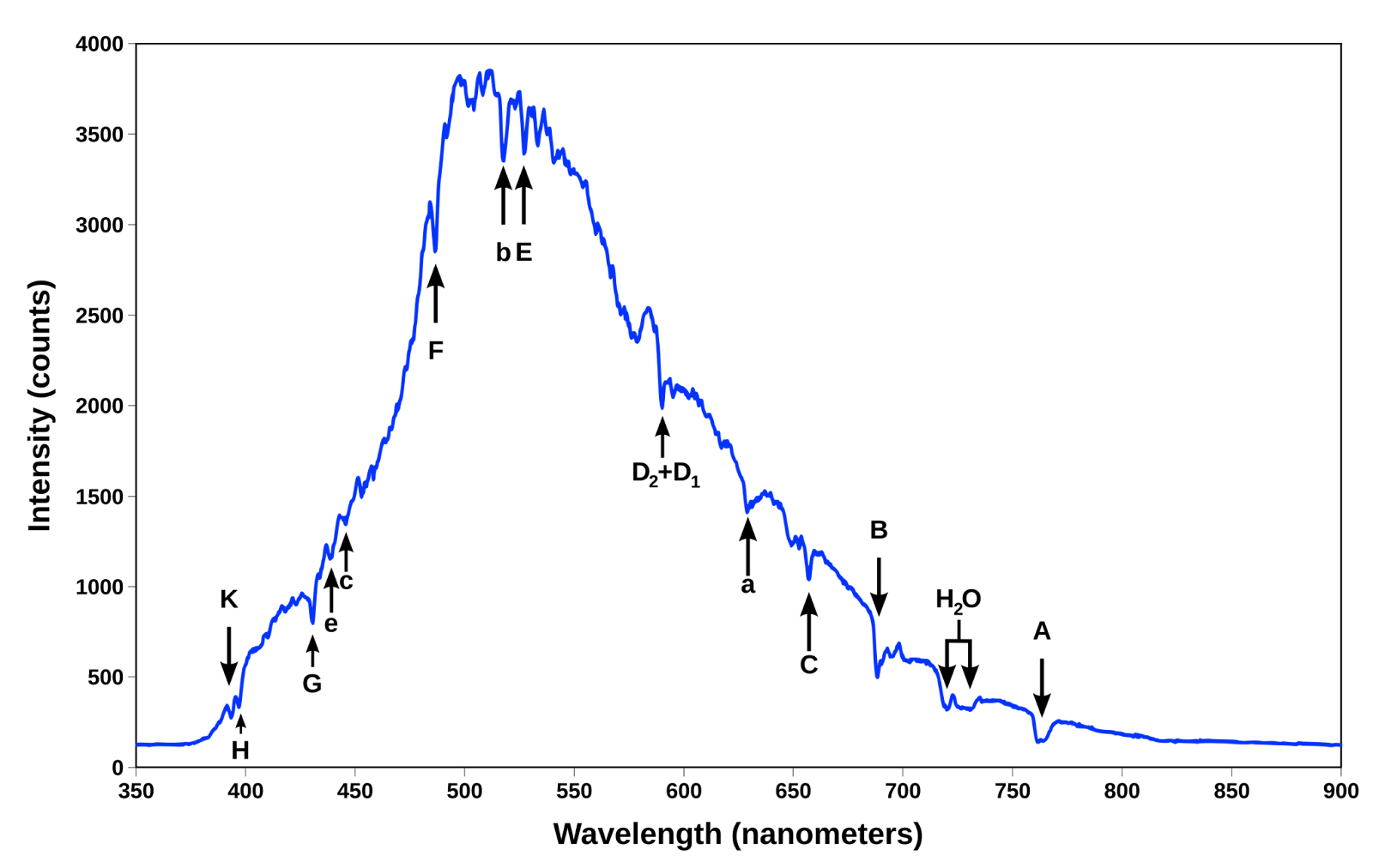 graph showing the spectral signature of blue sky, showing high reflectance in the blue part of the light spectrum (Wikipedia)
In order to match up what we’re seeing in the satellite image to the material we are interested in, we want to look at what’s called the ‘spectral signature’ of kaolinite. A spectral signature is a graph that shows, for a particular material, what proportion of different wavelengths of light you would expect to be reflected. For example, the ‘spectral signature’ of ‘blue sky’ reflects a lot of light around the ‘blue light’ wavelength. Light that isn’t blue gets absorbed, meaning that when you are looking at the sky, it’s blue light that’s reaching your eyes – resulting in a blue colour.
Below is the reflectance spectrum of kaolinite, marked in red, with the relevant Landsat bands marked in navy blue overlaid. This image was made using the USGS Spectral Characteristics Viewer, which allows you to map the reflectance spectrum of a mineral of interest against the bands of different satellite sensors, including the Landsat and Sentinel satellites.

The reason that kaolinite looks white in the first two images is that bands 2, 3, 4, 5 and 6 all have a high reflectance – so when those bands are slotted into the R,G,B channels of an image, they are all uniformly bright. However, we can see that the reflectance dips around 1.4μm, and that it drops off sharply after a wavelength of 2μm. Thus – much less light is reflected in band 7 (SWIR 2), meaning that in the 7, 6, 4 image, the G and B channels are bright but R is dark, hence cyan.
band ratios
As you might have noticed, the band comparisons are a bit of a blunt tool. We have to make images with several different bands before we notice the difference between them. This brings us to the next technique: band ratios. Band ratios are a type of index, a way of combining different bands together to highlight things like vegetation, moisture and different rock types. Typically, the word ‘ratio’ refers to a measure determined by dividing one satellite imaging band by another, in order to highlight materials whose reflectance is most different in those bands.
As shown in the previous example, kaolin clay reflects the most amount of light in the NIR band (5) and absorbs most light in the SWIR-2 band (7). We can look for the contrast between those bands using the 5/7 band ratio. By applying this band ratio, anything reflecting a lot of light in band 5 but absorbing a lot of light in band 7 will appear very bright, with materials with other absorption spectra appearing dark. This band ratio highlights a number of bright white spots in the images.
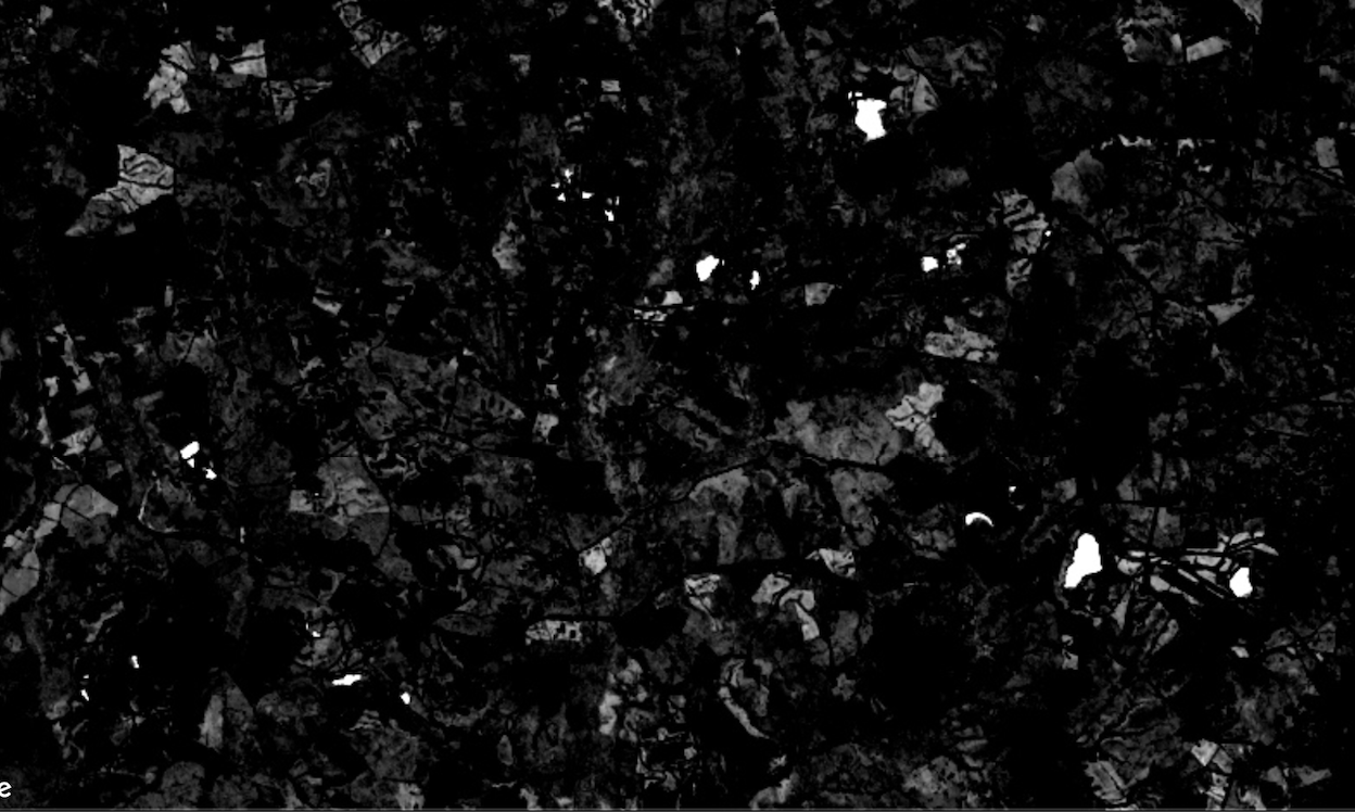 (Google Earth Engine/Landsat 8)
It would be tempting to conclude that this is where the kaolin mines are, but checking the location of active mining pits against the location of the white spots, it seems that, while they contain some bright patches, the mining areas are not the brightest parts of the image.
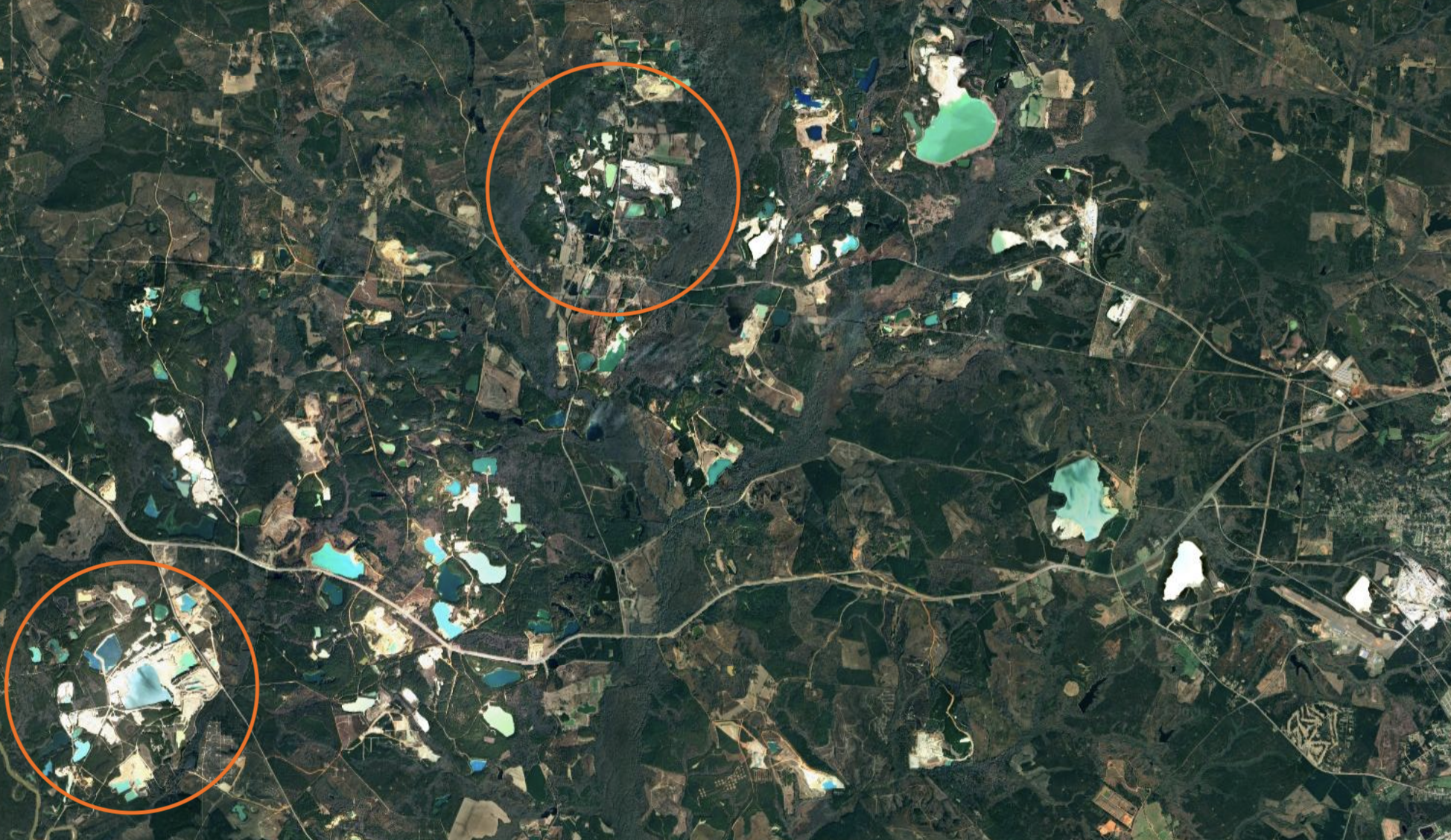 (Google Earth Engine/Landsat 8)
If we zoom into one of these mining areas – marked as Southeastern Performance Minerals LLC on Google Maps – we can see in detail what is being highlighted. Note that the two Google Earth Engine images appear pixellated at this scale, but the Google Maps image on the right is much higher resolution. That’s because Google Maps uses a bunch of different data, included private data, composited together to make its maps.
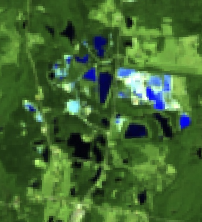 in the 7,6,4 image
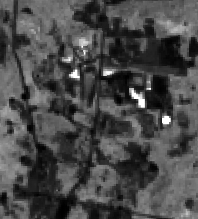 in the 7/5 band ratio
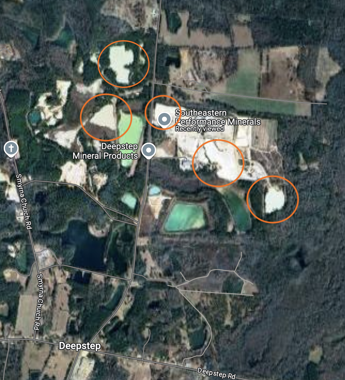 with salient features circled
By zooming in further to Google maps, the features most highlighted appear to be either lakes or lake beds. These may have a high kaolin content (and also may well be tailings lakes from mines!) but they aren’t exactly what we were looking for – so what happened?
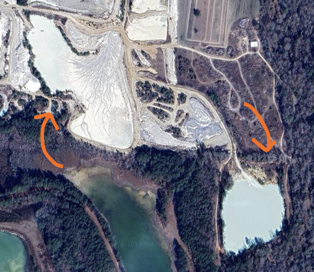 two of the areas most brightly highlighted by the 5/7 band ratio (Google Earth Engine/Landsat 8)
If we look at the spectral signature for turbid water with clay minerals with the USGS tool (blue line), we can see that even though these areas have much lower reflectance overall, because they reflects almost no light in the SWIR-2 band, they will have a much more extreme 5/7 ratio than that of kaolinite. We can also see this in the 764 image – they appear a much deeper shade of cyan, rather than bright! They just really don’t contain a red component.
 (Google Earth)
So - how do we see kaolin? When looking up the correct band ratio for kaolin (and clay minerals generally), most sources suggest 6/7 rather than 5/7. If we look at the spectral signatures above, we can see that this will also resolve our issue with turbid water, as the signature is low for both bands 6 and 7 in this instance. However, imaging the area using this ratio initially seems quite disappointing.
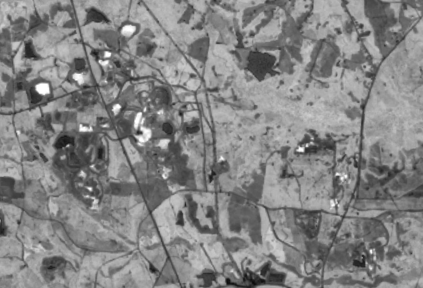 kaolin highlights with the 6/7 ratio show up much more on the kaolin mine in Wrens, Georgia, which is a couple of mines Northwest of the Sandersville site (Google Earth Engine/Landsat 8)
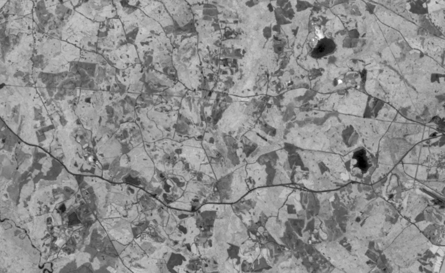 applying the 6/7 band ratio to the Sandersville kaolin mines and lakes (Google Earth Engine/Landsat 8)
However, what we notice is that areas that were uniformly white in all the initial images are now much more highly contrasting – which, if we are interested in mineral differences within the mining areas (rather that purely detecting them in the first place), can give us lots of information. To further highlight these differences, we can use this ratio as part of a false-colour image with other band ratios in which kaolin has a high contrast, derived from the spectral signature above.
- (5/7) → Red
- Clay minerals ratio (6/7) → Green
- (6/1) → Blue
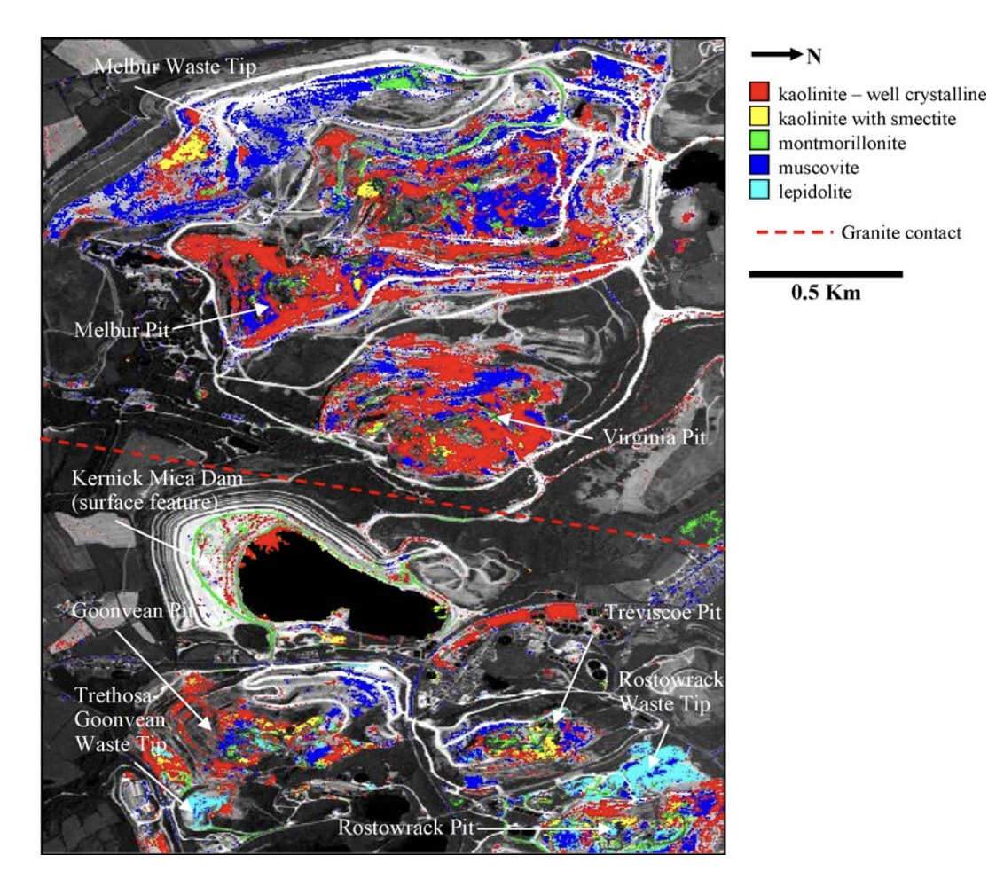 a diagram from the St Austell paper, showing the end result of a detailed analysis of different rock types and spectra
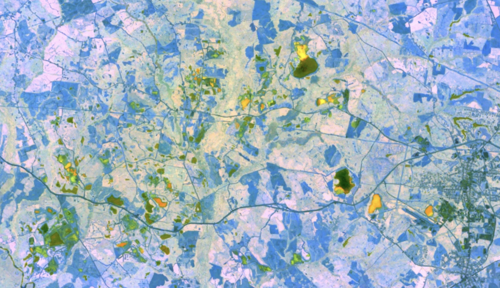 (Google Earth Engine/Landsat 8)
Although the areas potentially containing kaolin are not necessarily the brightest (as other minerals might have higher contrasts for one or other of these ratios) we can see that they contain considerably more variation, allowing us to see much more detailed differences within potential mining and tailings areas.
In practice, this method is still very rough. Within geological surveying, most of the pattern-spotting will use considerably more sophisticated techniques to highlight differences in reflectance – a common one is Principal Component Analysis, a mathematical approach to capture the largest variation in a given set of data, and will also use a thorough analysis of the geology of the region. This paper, which uses the HyMap hyperspectral hyperspectral imaging is distinct from multispectral imaging in that it uses hundreds, rather than tens of bands, giving a much higher resolution. The HyMap sensor is flown on a light aircraft above the site of interest, though there are other hyperspectral sensors (like NASA’s Hyperion sensor on board the EO-1 satellite) imaging sensor to image a series of kaolinite pits in St Austell, Cornwall, gives a sense of how these techniques are used in practice.
mining tailings in Picher, Oklahoma
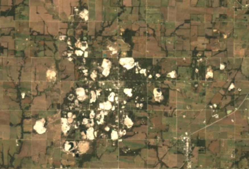 true-colour satellite image of chat piles in Picher, Oklahoma (Google Earth Engine/Landsat 8)
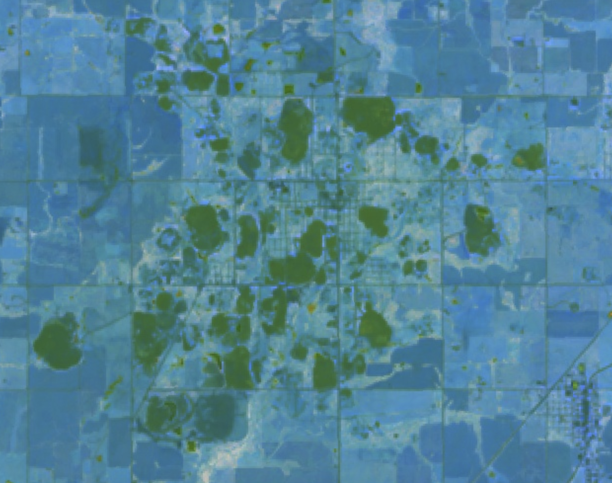 the same area with the kaolinite band ratio comparison applied (meh) (Google Earth Engine/Landsat 8)
Compare the kaolin lakes to piles of ‘chat’ – the by-products of lead and zinc mining – in Picher, Oklahoma. Picher lies in the centre of the Tri-state Mining District, a part of the federally-designated Tar Creek Superfund site near the Oklahoma/Missouri/Kansas border. Picher was subject to deregulated lead and zinc mining for more than 100 years, with huge piles of toxic chat – typically limestone, dolomite and silica – left on the town’s surface. The impact on the local area was devastating, with over 30% of the town’s children in a 1994 study suffering from lead poisoning. Despite being declared to have superfund status 30 years ago, efforts to undo the damage from mining are slow, with no date projected for when the site might be reusable.
When we look at the RGB image of Picher, these piles of chat look very similar in colour to the kaolinite pits in our first image, and also quite uniform. Using the kaolinite ratio, the piles are distinct from their surroundings, but still appear quite uniform and undifferentiated.
Unlike Sandersville, the rock here does not contain large amounts of clay minerals, but instead of a mixture of limestone and dolomite, within which lead and zinc ores are present. If we want to look for these rocks specifically, we can use a different set of ratios.
Geologists Sabreen Gad and Timothy Kusky developed sets of band ratios to differentiate between various rock types. In this example, we use the band ratio combination (S2/S1, S1/NIR, R/B) (e.g. 7/6, 6/5, 4/2), from this paper to highlight differences in the image. We can now see lots of detail in areas thst previously appeared uniform, particularly around the edges of the chat piles.
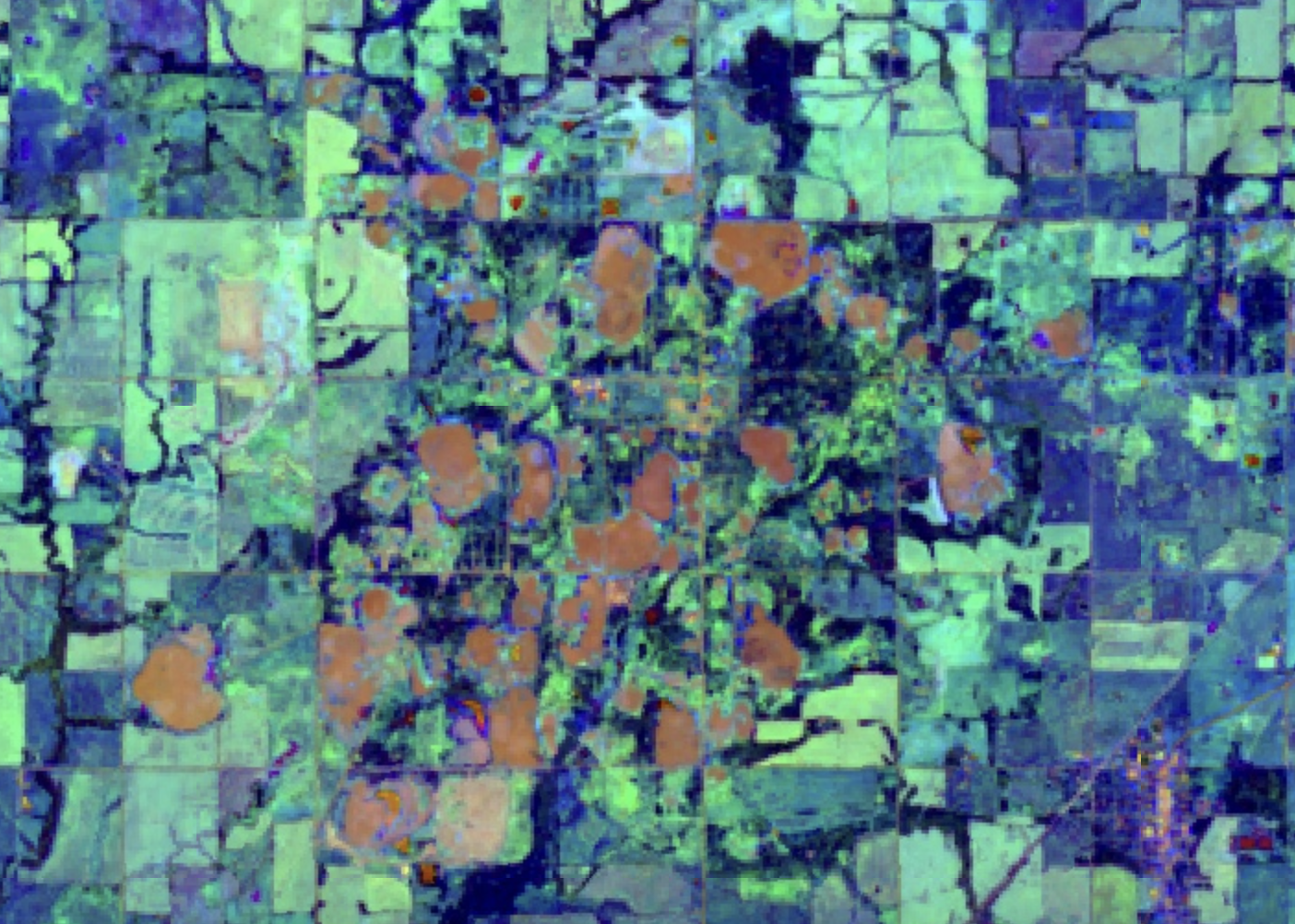 Picher, Oklahoma, with Gad and Kusky's band ratio applied (Google Earth Engine/Landsat 8)
using band ratios to track bauxite mining
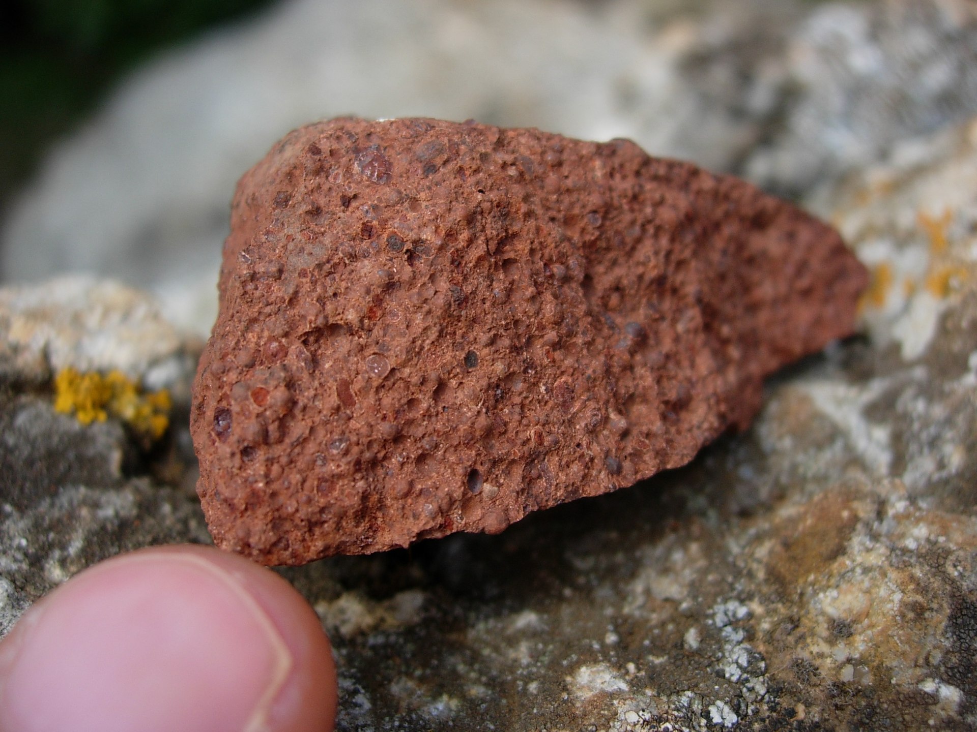
Bauxite is a sedimentary rock with a high concentration of aluminium minerals, and is used as the basis for over 99% of aluminium production worldwide. Surging demand for aluminium in recent years has driven massive expansions of bauxite mining operations, at the expense of the areas from which it is extracted, and to the profit of a small number of giant mining conglomerates, the most prominent including Alcan, Alcoa and Chinalco. Increasingly, Bauxite mining operations are extending into indigenous land, and are associated with deforestation, changes to hydrology and displacement of communities.
Bauxite is extracted using large open-pit mines, and dust from the industry often spreads to cover surrounding areas, and is widely considered to be an ecological disaster. Among other factors, a key side product of bauxite extraction is ‘red mud’, a highly alkaline and polluting slurry that contains large amounts of iron oxide, as well as aluminium oxide components, and is usually kept in large, toxic ‘tailings lakes’ close to processing facilities.
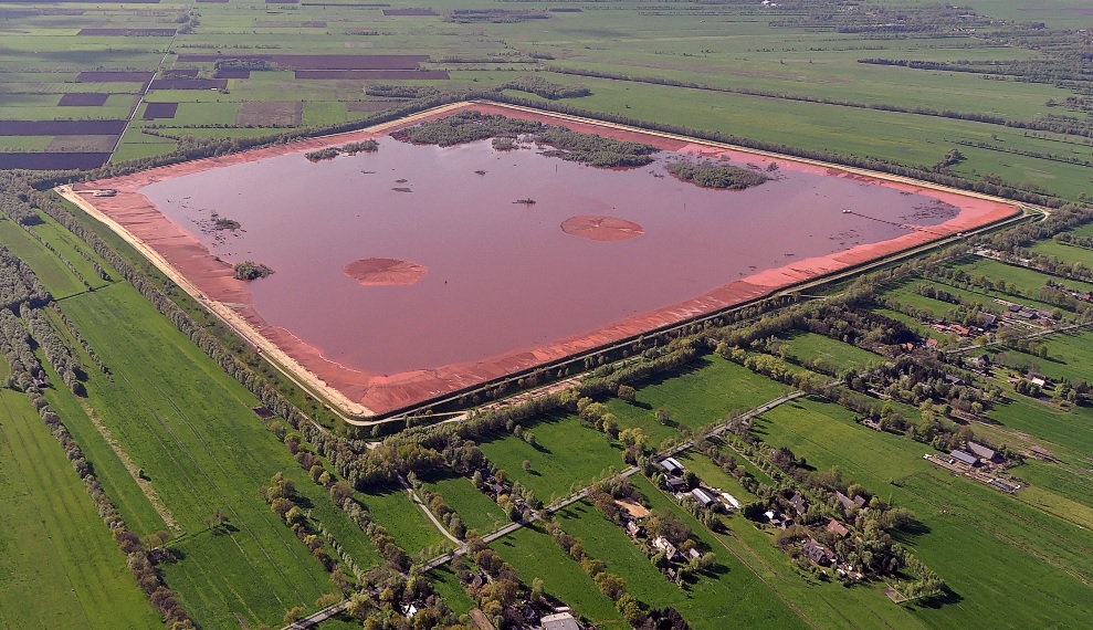 red mud in a tailings lake in Germany (Wikipedia)
In addition to the aluminium minerals gibbsite and boehmite, bauxite also contains high quantities of ferric iron oxide minerals goethite and hematite, which give it its characteristic reddish colour.
To find bauxite mines, it’s typical not to look directly for the spectral signature of alumina, which is harder to see using the bands we have available. Instead, we can use band ratios for other components of bauxite – in this instance, ferric iron oxides and Kaolinite. A three-part band comparison lets us identify the presence of these different minerals.
Instead of just looking for one of these at a time, we can combine them – as in the false-colour band comparisons used above. In this instance, I’ve used two ratios that highlight ferric iron oxides, to differentiate the areas with similar reflectance characteristics that are highlighted by one or the other.
- Ferric iron oxide band ratio 1 (4/2) → Red
- Ferric iron oxide band ratio 2 (4/3) → Green
- Kaolinite band ratio (6/7) → Blue (note: this ratio is also listed for laterite, another component of bauxite)
These were inspired by the approach taken in this paper, which uses Sentinel rather than Landsat imagery, but also uses ferric and kaolinitic minerals to help spot bauxites.
bauxite mining in Jamaica
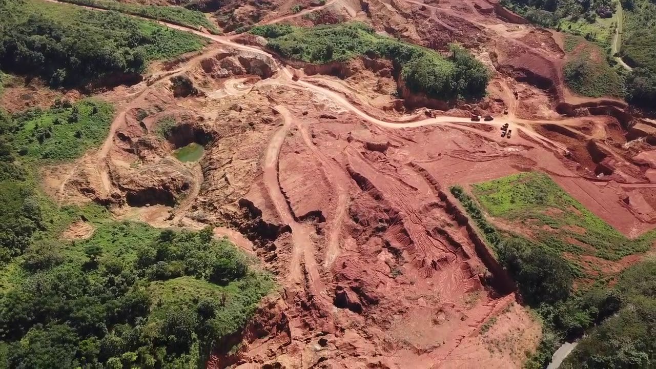 a bauxite mine in Jamaica’s St Ann Parish (JAMEN trust)
To test the efficacy of these ratio combinations, we can look first at an area with a well-documented bauxite mining industry. Bauxite has been mined in Jamaica for over 80 years, causing widespread ecological and social damage, and most recently threatening the ecologically sensitive Cockpit County region, which had previously been protected.
When we compare an RGB image of Jamaica to one made using these three-band combinations, we can see areas of bauxite mining highlighted very clearly in bright yellow, even when really zoomed-out. This band combination can be really useful for very quickly locating both mining areas, and even just exposed areas of soil in locations with a high iron-ore concentration.
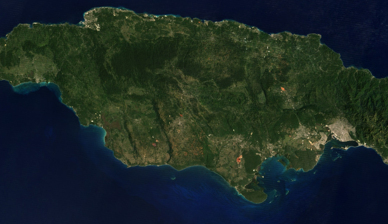 true colour satellite image of central Jamaica (Google Earth Engine/Landsat 8)
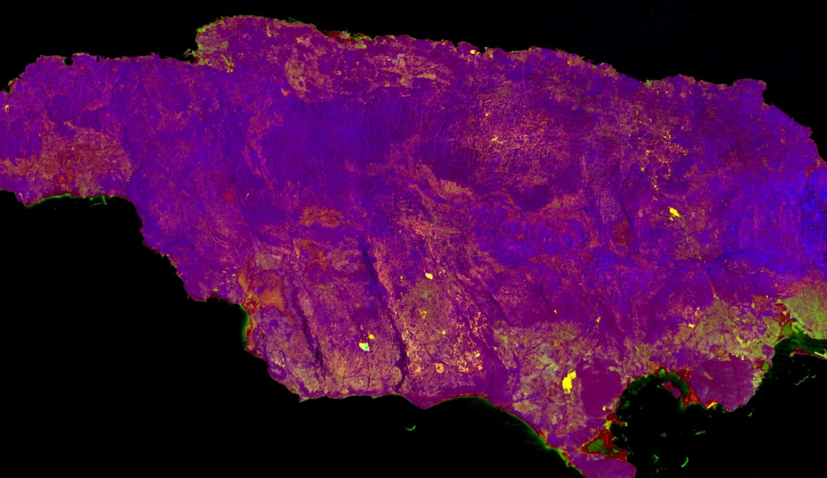 false colour image highlighting bauxite mines (Google Earth Engine/Landsat 8)
By comparison to the RGB image, we’re still able to see some very obvious features, but much of the landscape is far more subtle. If we zoom in to an area in Manchester parish, we can also see that this enhancing effect gives us a very clear outline of the areas exposed by forest mining operations.
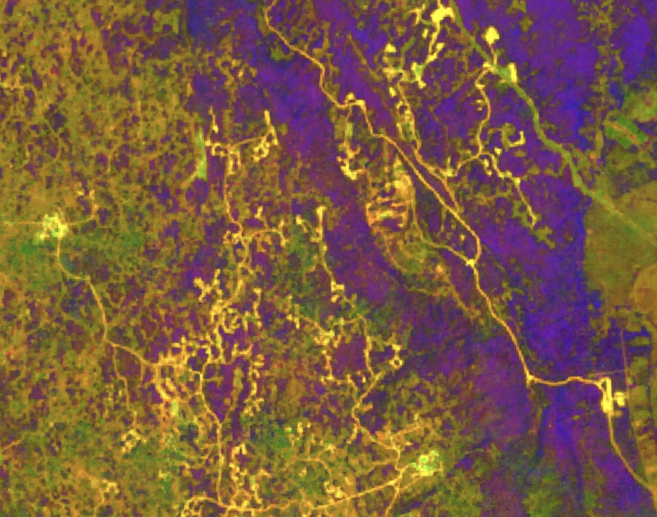 forest mines in Manchester Parish, highlighted using the bauxite band comparison (Google Earth Engine/Landsat 8)
To check that the mining sites we have found are what they seem to be, it’s possible to cross-reference government-issued mining licenses worldwide using the USGS Mineral Resources map. This is most accurate within the United States, but contains information about mines worldwide. Wikimapia also contains mines on an infrastructure layer, though they typically record fewer sites.
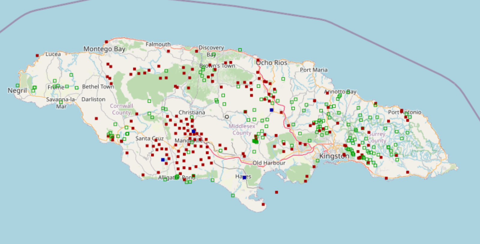 A screenshot of Jamaica rendered on the USGS Mineral Resources Online Spatial Data map tool, showing mines (past and present) in red, prospects in green and processing plants in blue. It’s possible to see right away the bright yellow areas in the south centre of the satellite match up with the large number of mines south of Mandeville on the USGS map.
For a much fuller report on bauxite mining’s past, future and causes in the region, Jamaica Environmental Trust produced a research report entitled Red Dirt. In particular, Chapter 5 – Degradation of Ecological Heritage by ecologist Susan Koenig – provides a detailed overview and analysis of the close relationship between geology and ecology on the region, and the long term impact of surface mining on soil and air quality and the karst water cycle.
Kuantan mining disaster
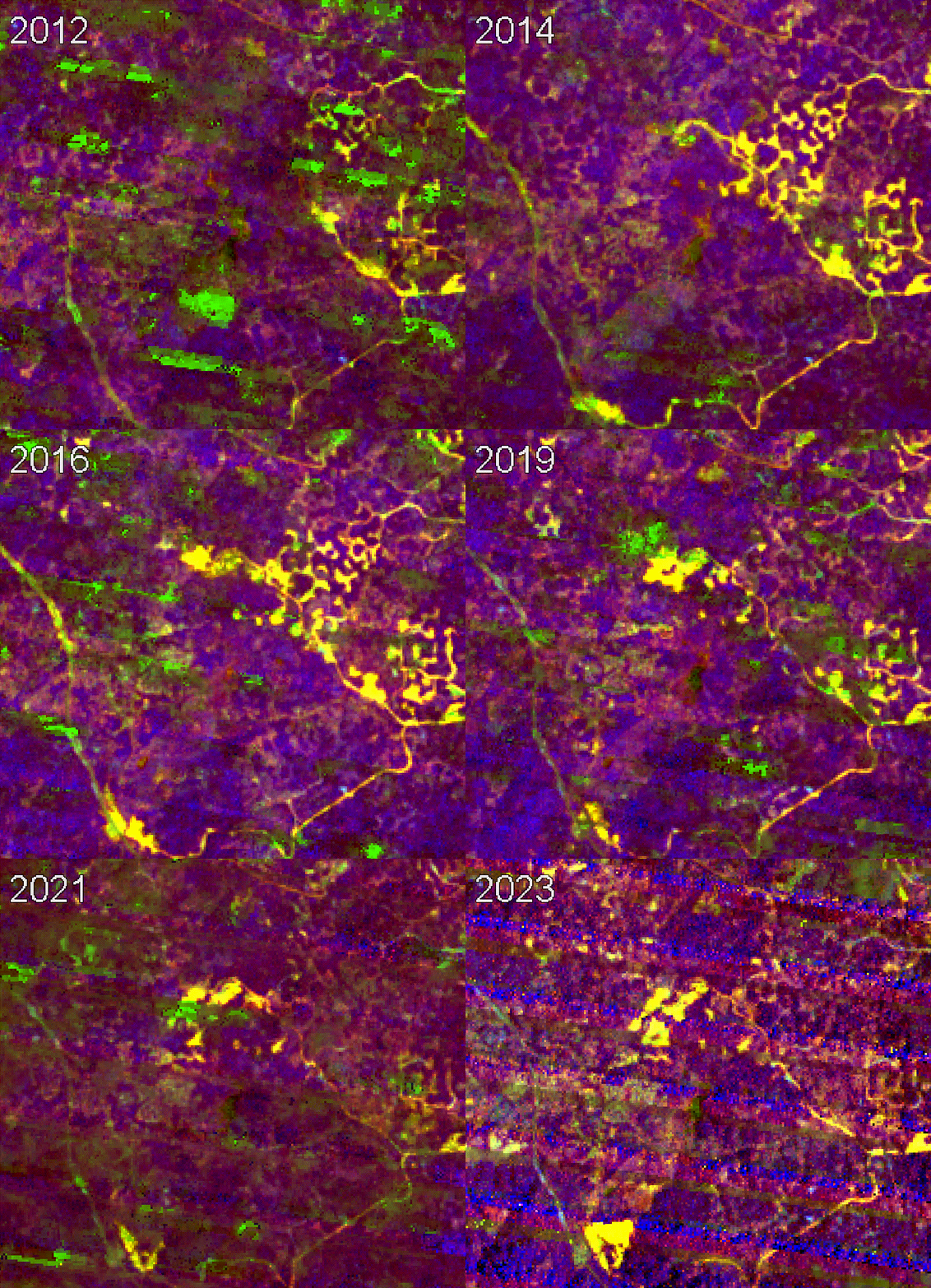
timelapse of spreading and disappearing bauxite mines in Kuantan, Malaysia. Note – the green artefacts in the image are due to cloud cover; the striping is due to the edges of Landsat tiles. (Google Earth Engine/Landsat 7)
With this model, it’s possible to see changes in other mining areas. Consider the following timelapse image, showing changes to the Bukit Goh bauxite mine in the Malaysian district of Kuantan between 2012-2023. Bukit Goh lies at the epicentre of the 2015-16 Kuantan Bauxite mining disaster, which saw deregulated mining operations tear through farmland, and spread polluting bauxite dust over roads, severely polluting waterways. Changes in legislation to neighbouring Indonesia’s bauxite exports in 2014 caused demand in the region to skyrocket, with Malaysian bauxite production increasing 100-fold from 200,000 to 20 million tonnes between 2013-15. Again, the areas mined or affected by dust pollution are highlighted in a bright yellow, with healthy vegetation appearing as a darker blue.
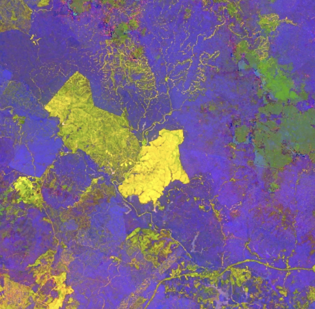 image of a bauxite mine near Kuantan 2015 (Google Earth Engine/Landsat 8)
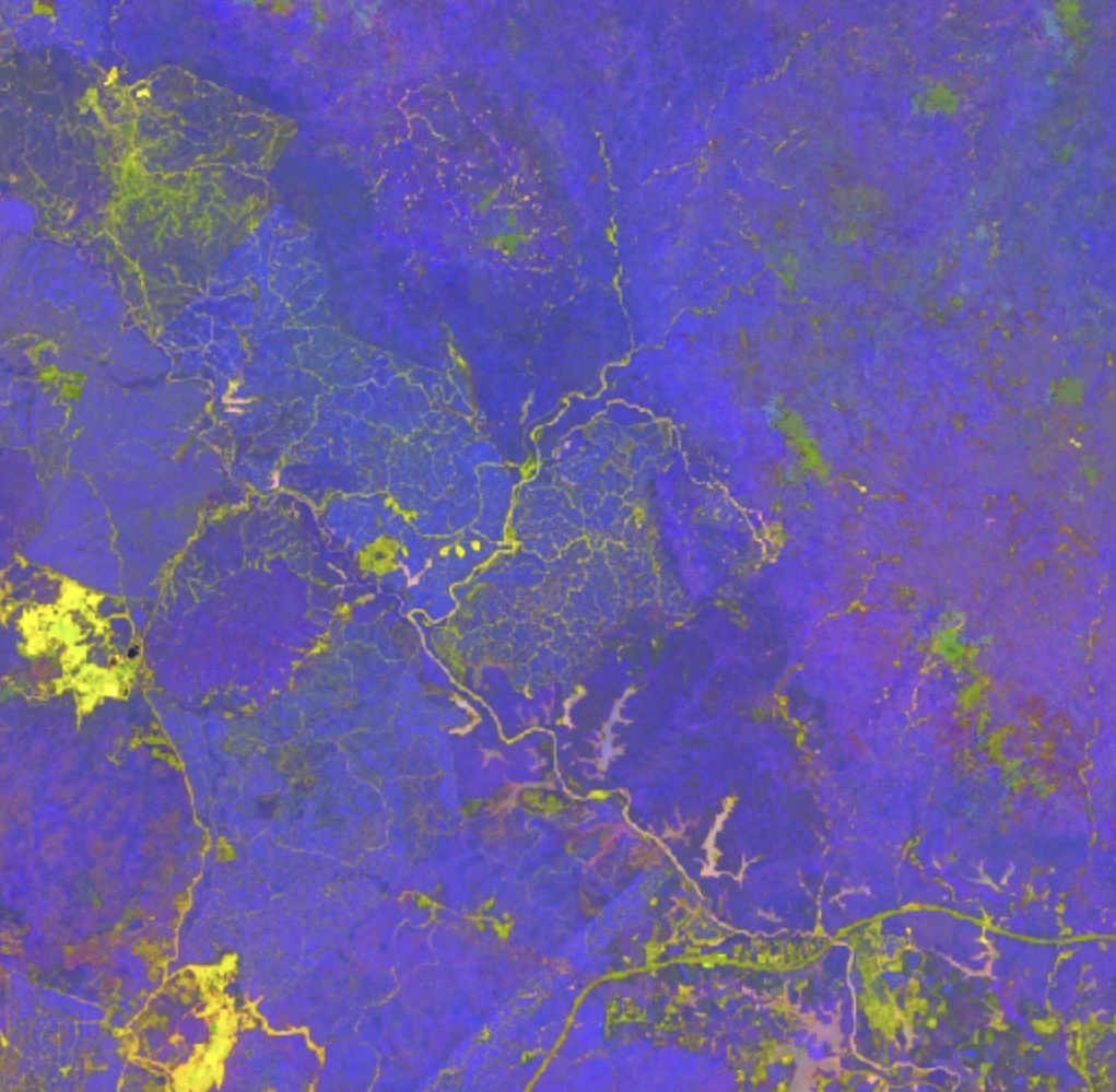 the same mine covered with topsoil in 2023 (Google Earth Engine/Landsat 8)
In the immediate aftermath of the 2015-16 disaster, the Malaysian government prevented the issuance of new mining licences and ordered the remediation of damaged land. We can see that between 2017-19 some of the mined land has been covered with topsoil. However, more recently – possibly following the 2019 reissuing of mining licences to bauxite companies by the Malaysian government – we can potentially see new areas once more expanding toward the bottom left of the timelapse.
bauxite mining in West Kalimantan
We can use the same technique to look at Bauxite mines in Indonesia, another country that has seen massive mining-based land grabs over the past 2 decades. One particularly affected area surrounds the Kapuas river in West Kalimantan.
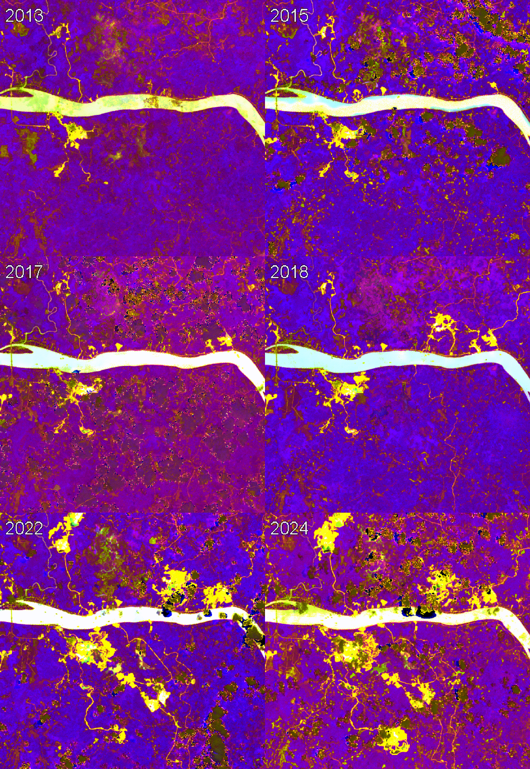 timelapse of pausing then spreading bauxite mine expansion around the Kapuas river, near the village of Tayan, Indonesia (Google Earth Engine/Landsat 8)
A 2015 study of land grabs in the region directly linked the drying of a lake to bauxite mining expansion in 2013-14, and named bauxite extraction as part of a linked set of extractive industries encroaching on indigenous peoples’ livelihoods. While bauxite extraction slowed after Indonesia’s 2014 policy to end exports of the mineral, local people have been offered little other than financial compensation (‘dust money’) for the damage done, with mines still expanding in some areas, and little to no remediation with topsoil.
If we take a timelapse of an area around the Kapuas river (the area in the above image with a concentration of yellow-white areas) between 2013 and 2024, we can see that there was barely any expansion of the yellow-white spots indicating possible bauxite mines between 2014 and 2018. This coincides with a 2014 ban by the Indonesian government on certain raw materials including bauxite. However, the spots continue to expand again after 2018.
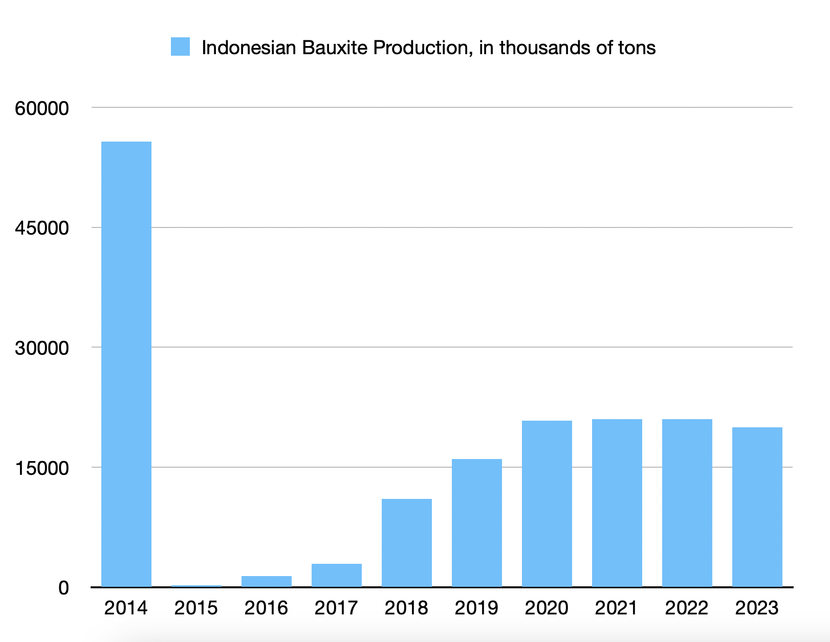
chart of changing Indonesian bauxite production, 2014-2023 (data from USGS mineral commodity summaries)
This timelapse mirrors the USGS mineral commodity summaries figures for Indonesia’s bauxite production during that timeframe: a significant drop following the export ban in 2014, followed by an increase in subsequent years.
In addition to the USGS map referenced before, we can use a number of different sources to cross-check these images. First of all, the Nusantara Atlas project works to record major drivers of deforestation in the region, producing high-quality satellite maps of land use, cross-referenced with government issued licenses.
The Indonesian government also maintains a detailed interactive map of mining concessions in the region, allowing us to check not only the minerals being extracted, but also to get a fine-grained picture of which companies (often local subsidiaries of major multinational mining companies) have mining licenses to different areas. This is partly possible with the USGS tool, but the government tool gives a far more detailed picture, showing concession areas and different forms of license. The following screenshot shows the Tayan Hilir region of the second gif, with each blue diamond representing a bauxite (‘bauksit’ in Indonesian) deposit.
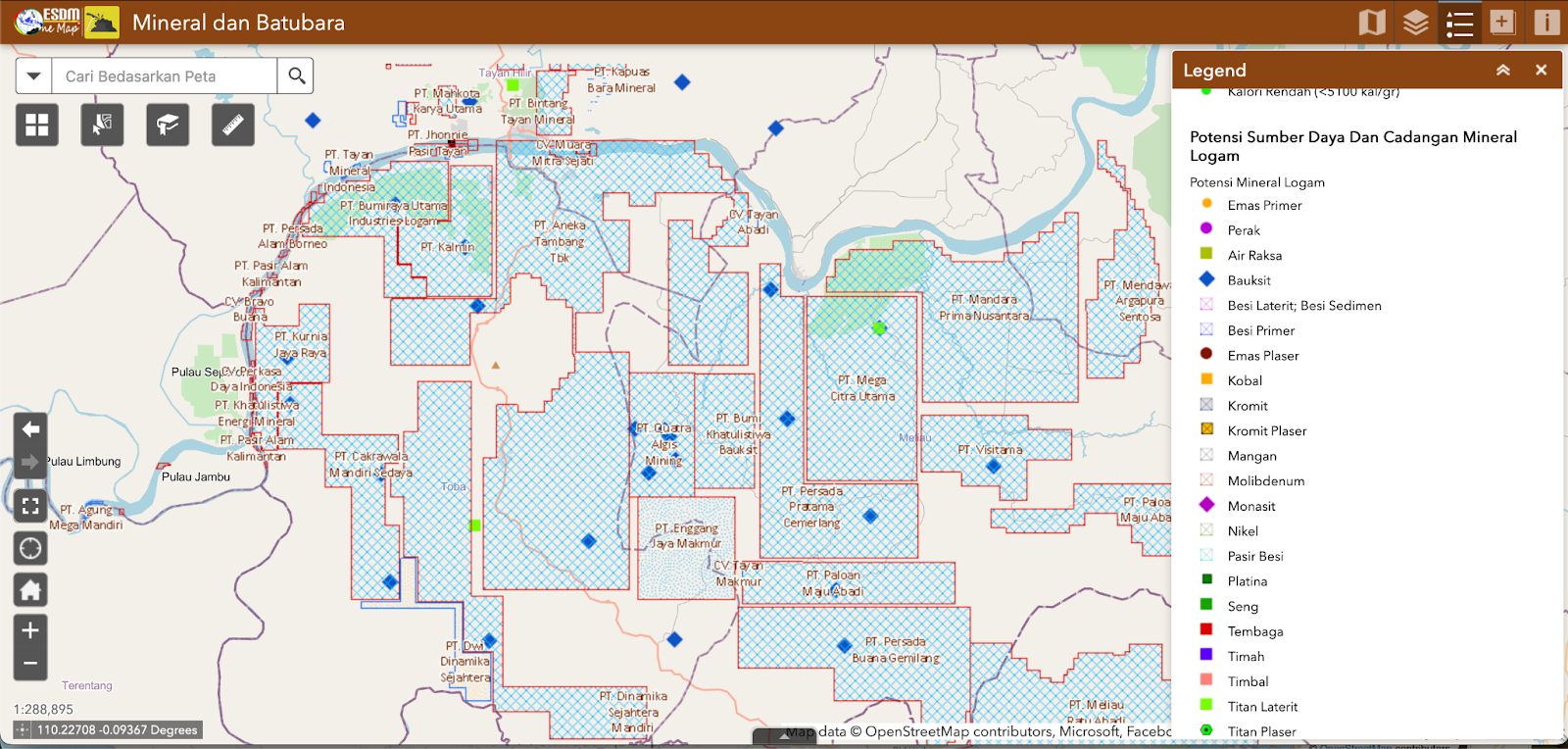 (Google Earth Engine/Landsat 8)
What band ratios give us in each of these cases is a tool to highlight change far beyond what could be seen using visible-range images. As a use-case, mining gives us a particular set of cross-referencing tools, including both geophysical and economic tools more commonly used for prospecting.
making use of other indices
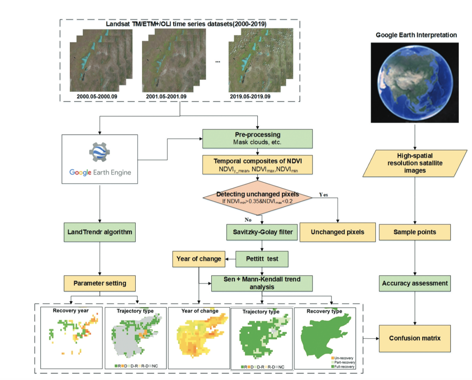 diagram from Han et. al’s paper outlining the application of the Landtrendr algorithm and NDVI
While geological band ratios can be very useful by themselves for clearly delineating different mineral areas, they may also be used in conjunction with other satellite imaging indices to make causal analyses about the effects of mining on the landscape. Two popular indices are the NDVI and NDWI – the Normalised Difference Vegetation Index, and Normalised Difference Water Index, and give information about vegetation health and moisture levels respectively.
These indices can link mining to the broader political ecology of the region, understanding disparate impacts on hydrology, soil health, and agricultural viability. It’s worth noting that these should be used thoughtfully – for example, both these indices change with the seasons, and the NDWI is also strongly affected by cloud cover (this makes analyses of areas affected by Bauxite mining particularly challenging, as most fall within the warm, wet and cloudy tropics).
This 2021 paper by Han et. al, gives a well-explained example of using the NDVI within a robust time-series system to track vegetation degredation and recovery in reclaimed mining areas (their focus is on areas around Beijing, but the technique applies more generally).
limitations
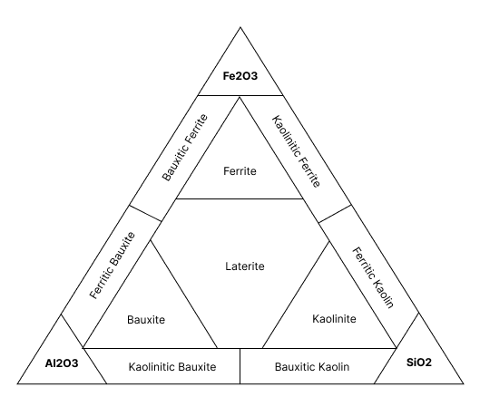 bauxite mineralogy diagram, showing balance between ferrous and clay minerals
All of these examples use very simplified models of the geology, which can introduce important variation in remote sensing work. For example, within ‘bauxite’ as a class of mineral, there is a huge amount of variation, including between carbonate (including Jamaican) vs lateritic (including Malaysian and Indonesian) bauxites (which delineate from which rock body the bauxites are formed), the proportion and distribution of kaolins vs laterites, and the profile of deposits in the region. This detail is beyond the scope of this article, however, this paper on the mineral classification of bauxite deposits in the Tayan region gives a good overview of the different kinds of analysis that are applied.
Likewise, areas with similar concentrations of minerals will be highlighted by similar ratios – because of the reliance on iron oxides to highlight soil potentially containing bauxite, iron mines are also highlighted by this band comparison. If we wanted to differentiate them, we would want to look for minerals contained in one instance, and not the other.
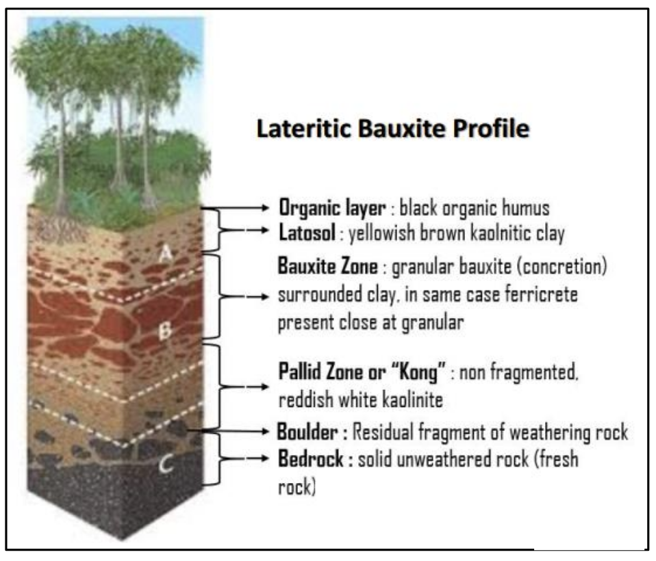 diagram of bauxite profiles in the Tayan region, from the Tayan mineral classification paper
A second limitation on geological indices is vegetation – in areas where rock is not exposed, often it’s easier to make inferences about rock types using vegetation variation as a clue, rather than using the reflectance spectra of the rocks themselves, as if they are covered then this will not be visible to satellites.
Another key limitation to satellite imaging work is the presence of clouds, and these can be particularly misleading when using false-colour images, as they’re far less easy to recognise. A common ‘sanity check’ is to switch back to the true colour image, in order to check that what you’re seeing is something that’s actually on the ground.
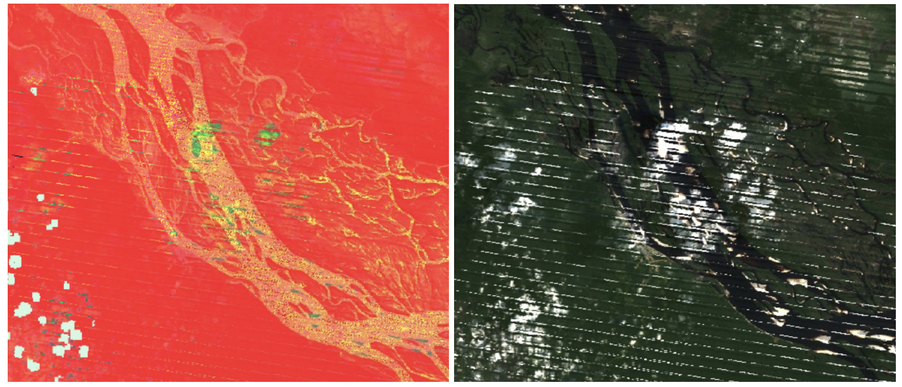 artefacts in a river in the Amazonas basin turn out just to be clouds when examined in RGB… (Google Earth Engine/Landsat 8)
Lastly, when using satellite imagery it can be tempting to draw premature conclusions about the meaning of different zones and artefacts. For example, one might note that an area appears to have very high concentrations of Ferrous Sulphate, as the wavebands associated with FeSO3 are bright in images tuned to detect those wavelengths. However, there are a range of other minerals that might also follow a similar reflectance pattern. One way around this is to match up with what is on the ground, or use it as an indicator in conjunction with other evidence. Rarely, if ever, is satellite imaging alone enough to confirm or deny the presence of a substance, but it can be a very useful tool to provide clues, and to demonstrate changes over time.
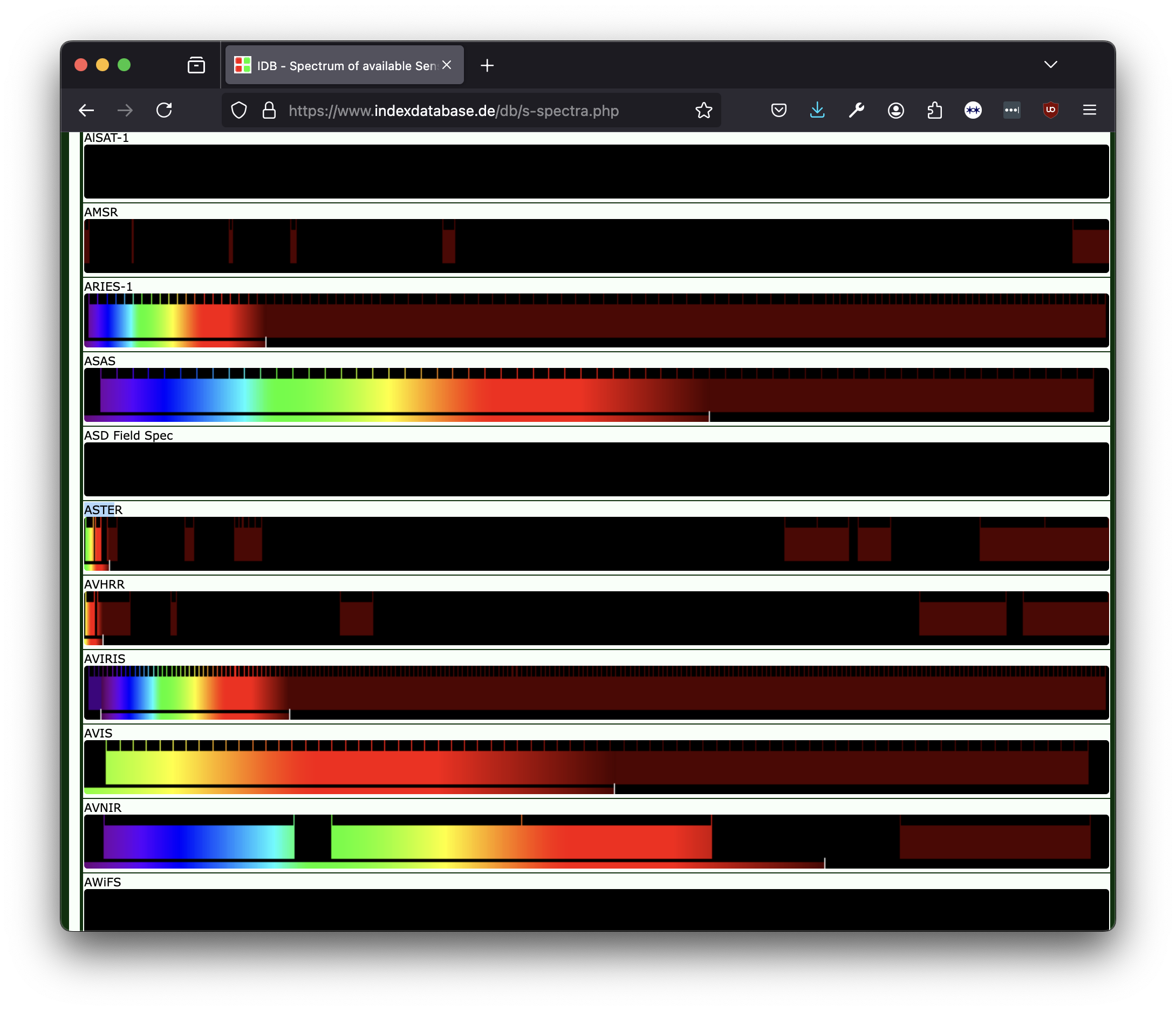 indexDB’s list of sensors by bands, showing where different satellite imaging sensors collect light
finding and using indices
There are a number of tools available that can help determine useful band combinations and ratios, and indices for a given application.
The website IndexDB is a fantastic resource for finding possible indices and band ratios. IndexDB maps between satellite imaging datasets (referred to there as ‘sensors’, denoting the instrument used to capture the data), indices (including band ratios), and ‘applications’, which refer to families of indices that may be used in a particular analysis.
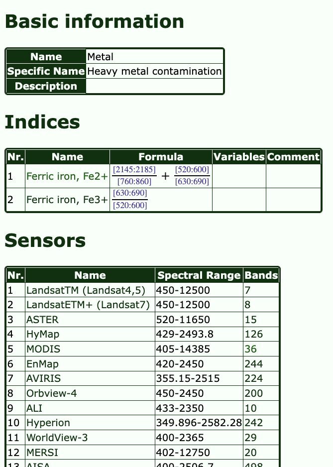 search results for the application ‘Heavy Metals Contamination’, showing possible indices and sensors with relevant bands (IndexDB)
For example – if I am interested in looking at heavy metals pollution in topsoil, I can select this application, and see a list of relevant indices. Choosing one of these (e.g. FeO3) will bring up a list of sensors with bands suitable for calculating the relevant ratios. Selecting one of the listed sensors will then bring up the calculation with the relevant bands for that dataset, along with references to literature.
One thing you might notice about IndexDB is the high number of sensors that are listed. The list is quite exhaustive, and doesn’t always give a clear idea of other factors relevant to use in open-source investigations, such as timeframe, spatial and temporal resolution, cost, availability and ease of use. One way to cross-reference this information is by using Google’s Earth Engine Data Catalog, which lists datasets available freely on the platform, with accompanying metadata that can serve as indicators for the usefulness of a dataset to a given application. Sometimes, however, this metadata can be a little misleading. NASA’s ASTER dataset, for example, will often appear to be a great option, because of the large number of bands it contains, with a good spatial resolution and a timeframe. However, most of the most useful bands for geological work (namely short wave infrared) were only active from 2000-2008, meaning they cannot be used in contemporary analyses. If in doubt, Landsats 7, 8 and 9, Sentinel 1 and 2, and MODIS are all good and freely-available starting datasets.
Outside of the indices listed in IndexDB, information about if and how a substance can be differentiated via band ratios can be discovered by searching Google Scholar for academic papers. It’s also possible to approximate your own band ratios, using tools such as the USGS spectral characteristics viewer, as mentioned earlier in the article.
Often the choice of precise bands can be a little more subtle than simply examining a single substance, with some bands being chosen over others to avoid confusion with similar reflectance patterns. As such, it’s wise to complement experimentation with tools like the spectral characteristics viewer with academic references.
extending mineral investigations
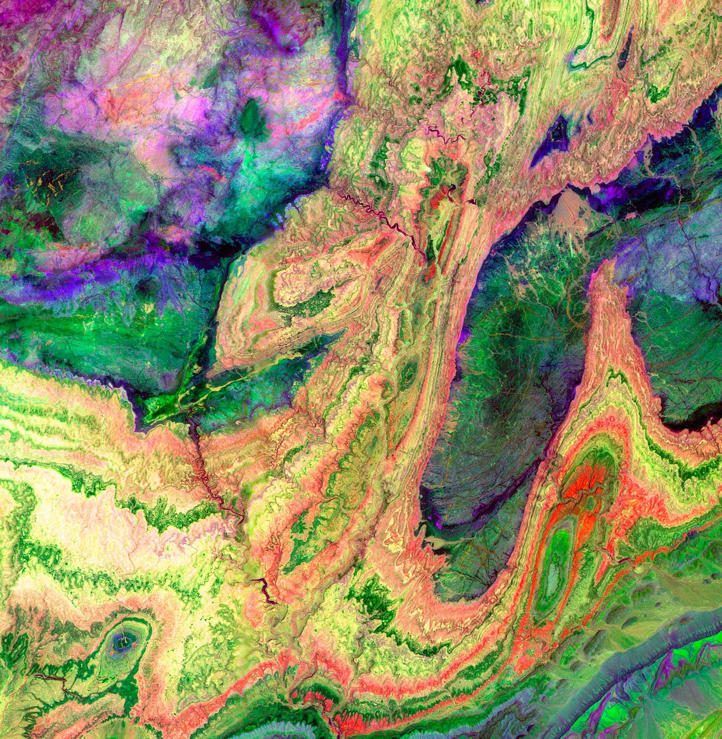 a detailed false-colour image of rock types in Morocco’s Anti-Atlas mountains, created using infrared light collected by the ASTER satellite (NASA)
For more complex lithological and geological information when contemporary data is not as necessary, NASA’s ASTER satellite collected detailed data in the short wave infrared bands from 2000-2009 (after which the sensors unfortunately malfunctioned). Many of the examples in the open-source Awesome mining band ratio list relate to ASTER-based analysis.
Much of the most precise contemporary research and investigative work makes use of band ratios and indices within the wider toolset of machine learning, and other mathematical techniques such as principal component analysis. Platforms such as Sentinel’s EO-Learn contain a number of open-source machine learning models and examples, and Google Earth Engine also provides a rich toolset for training machine learning algorithms.
A great starting tutorial to take these techniques further is Ollie Ballinger’s Remote Sensing for OSINT, which includes a detailed case study on using machine learning techniques to identify oil refineries in Northwestern Syria. For an example of the same linear regression and machine learning techniques applied specifically to the context of mining pollution, this 2021 article uses eight spectral indices in total to infer the presence of heavy metals in topsoils in the Daxigo mining area in the Shaanxi province of China.
 detailed spatial distributions of heavy metals pollution in Daxigou mining area, calculated from Landsat 8 imagery using machine learning techniques source.
conclusion
Multispectral satellite imaging provides a broad and varied range of information about the Earth’s surface, including much that is invisible to the naked eye. By amplifying subtle differences in how materials reflect different kinds of light, we can make quite sophisticated inferences about a landscape’s ecological and geological properties. Like all forms of remote sensing, satellite imaging is one of a suite of tools that allows us to see alongside what might be happening on the ground, rather than a replacement for it. Academic fields such as ecology and geology have long-standing techniques for using this information in a replicable and verifiable manner, and increasingly, use tools such as machine learning to enhance these indices’ effectiveness.
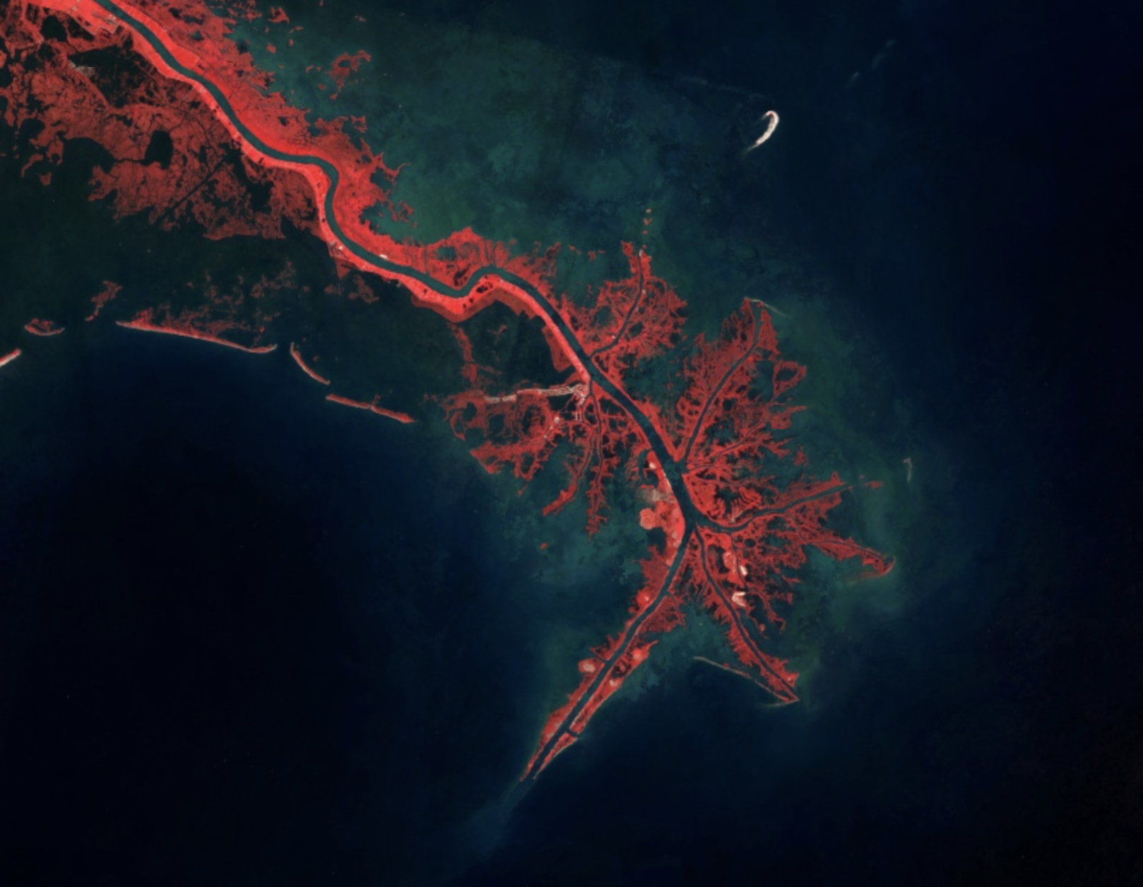 a Near Infrared band comparison image of the New Orleans bayou (Google Earth Engine/Landsat 8)
Ultimately, what these images provide us with is a set of lenses that may be applied to see a landscape differently. This extended form of vision is useful both in the direct identification of surface changes, such as the expansion of mines, the spread of pollutants, and changes to vegetation, but can also play a subtler role in articulating the mutual influence between political and ecological struggles.
All of this code was written using the Google Earth Engine platform, and is available on Github here. GEE requires you to write code, but is a good option in terms of being free, well-documented and cloud-based (e.g. doesn’t require you to download large datasets). An open-source desktop application is qGIS, which does not require code (though does mean you need to download the data locally). No-code platforms such as Copernicus Browser also have presets for common indices like the NDVI and NDWI, and allow you to swap out different band combinations.
The work that went into this guide was supported by open-source investigative bureau Bellingcat. Melissa Zhu and Galen Reich of Bellingcat both contributed extensive help, advice and editorial support to the writing this guide. Thanks also to Kat MacDonald, Murad Khan, Sergio Calderón Harker and Didem Incegoz, who gave feedback on drafts, to ecologist Austin Wade Smith who discussed this project with me very early on, and geologists James Aber (incredible website) and Roger Wheate, who were both kind enough to talk to me about their work, and whose open-source resources are also invaluable.
If this guide is of any use to you, or you have further questions free to email me. I also compiled the references used in my research here (for general satellite imaging techniques), and here for mining-specific resources.
